Working with Cactus horizons
In this notebook, we learn how to work with horizon data.
(This notebook is meant to be converted in Sphinx documentation and not used directly.)
[1]:
import matplotlib.pyplot as plt
import numpy as np
from kuibit.simdir import SimDir

%matplotlib inline
The best way to access horizon data is from SimDir:
[2]:
hor = SimDir("../../tests/horizons").horizons

print(hor)
Horizons found:
3 horizons from QuasiLocalMeasures
2 horizons from AHFinderDirect
As we see, kuibit found some horizons. kuibit looks for data from QuasiLocalMeasures and AHFinderDirect. These two thorns use different indexing systems, and, at the moment, you must provide both to uniquely indentify an horizon. If you need information from only one of the two (e.g., you want to plot the apparent horizon), you can also use the functions get_apparent_horizon and get_qlm_horizon.
[3]:
h1 = hor[(0, 1)]
print(h1)
Formation time: 0.0000
Shape available
VTK information available
Final Mass = 5.538e-01
Final Angular Momentum = -3.598e-07
Final Dimensionless Spin = -1.173e-06
You can find the available indices using suitable attributes:
[4]:
print(hor.available_qlm_horizons)
print(hor.available_apparent_horizons)
[0, 1, 2]
[1, 2]
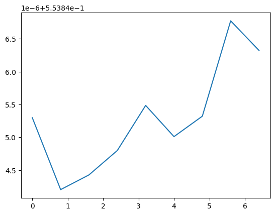
Once an horizon is fixed, you can access all the properties from QuasiLocalMeasures and from AHFinderDirect as attributes. These are all TimeSeries. For example, the mass as computed by QuasiLocalMeasures:
[5]:
plt.plot(h1.mass)
[5]:
[<matplotlib.lines.Line2D at 0x7fa1e99c2490>]
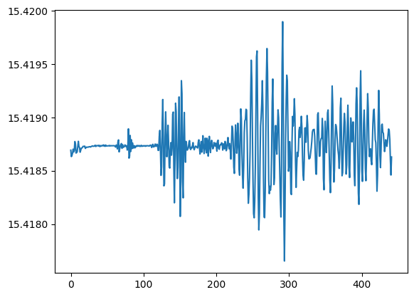
For quantities from AHFinderDirect you have to use the ah namespace:
[6]:
plt.plot(h1.ah.area)
[6]:
[<matplotlib.lines.Line2D at 0x7fa1e96d1e50>]
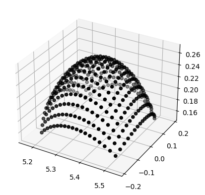
kuibit can also work with shape data. AHFinderDirect uses multiple patches, we can plot an example in 3D. matplotlib is not the correct tool for 3D plotting, but it will convey the idea;
[7]:
import matplotlib.pyplot as plt
%matplotlib inline

px, py, pz = h1.shape_at_iteration(0)

ax = plt.axes(projection='3d')
# We plot one patch
ax.scatter(px[0], py[0], pz[0], color="black", edgecolor='black')
[7]:
<mpl_toolkits.mplot3d.art3d.Path3DCollection at 0x7fa1e984b230>
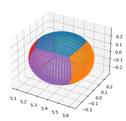
If you plot all the patches, you will have the horizon in 3D.
[8]:
ax = plt.axes(projection='3d')
for ind in range(len(px)):
    ax.scatter(px[ind], py[ind], pz[ind])
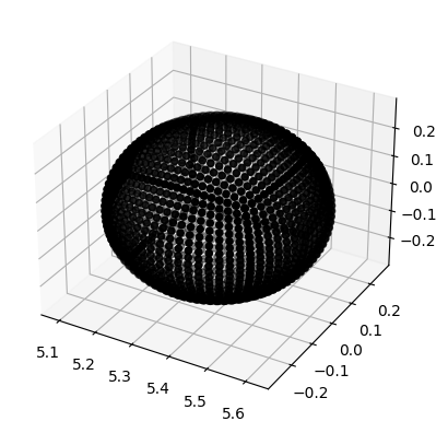
[9]:
# Or, to make it look like a black hole
ax = plt.axes(projection='3d')
for ind in range(len(px)):
    ax.scatter(px[ind], py[ind], pz[ind], color="black")
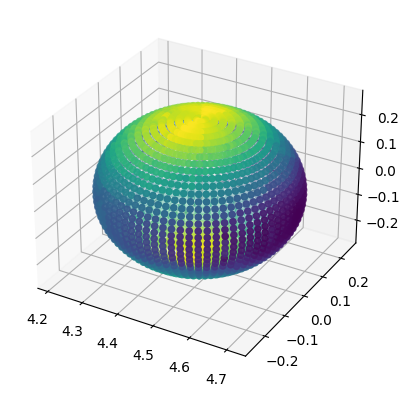
When VTK data is available (QuasiLocalMeasures::output_vtk_every set to a non-zero value), it is possible to work with QuasiLocalMeasures quantities defined on the horizon mesh. VTK data is stored in the vtk attribute, which is a dictionary that maps iterations to a dictionary-like object with the various variables. The most important VTK variables are coordinates, which are the 3D coordinates of the mesh, and connectivity, which describes how the various points are connected
one with others.
Matplotlib does not have good methods to plot meshes, so we will look at a simple example with a cloud of points.
[10]:
coordinates = h1.vtk_at_it(0).coordinates
# Let's consider one VTK variable
psi4_real = h1.vtk_at_it(0).repsi4

ax = plt.axes(projection='3d')
# coordinates is a list of (x, y, z) points, we
# transpose it and unpack it to use it as argument
# for scatter. Then, we color it with the values of
# psi4_real
ax.scatter(*coordinates.T, c=psi4_real)
[10]:
<mpl_toolkits.mplot3d.art3d.Path3DCollection at 0x7fa1e44a2990>
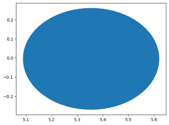
In case you want to work with a 2D slice, of the shape, you can use the method shape_outline_at_iteration and specify how to cut the shape.
Note that the the distributions of points is not uniform across the horizon and kuibit does not do any interpolation across points. Therefore, there are values of cut that will lead to a malformed horizon. It is recommended to use cuts that are along the principal directions.
[11]:
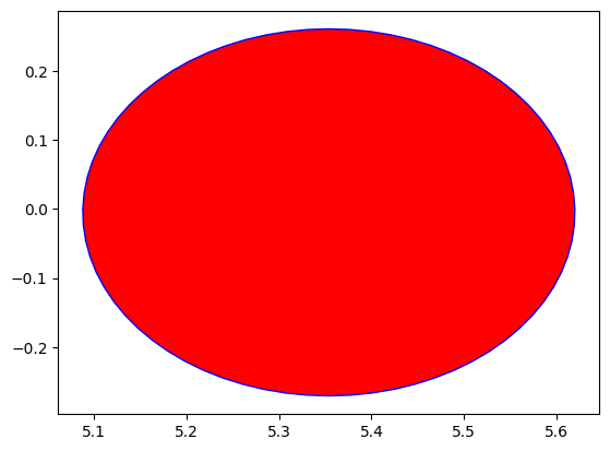
cut = [None, None, 0]  # Equatorial plane (z=0)

shape = h1.shape_outline_at_iteration(0, cut)

plt.fill(*shape)
[11]:
[<matplotlib.patches.Polygon at 0x7fa1e3832d50>]
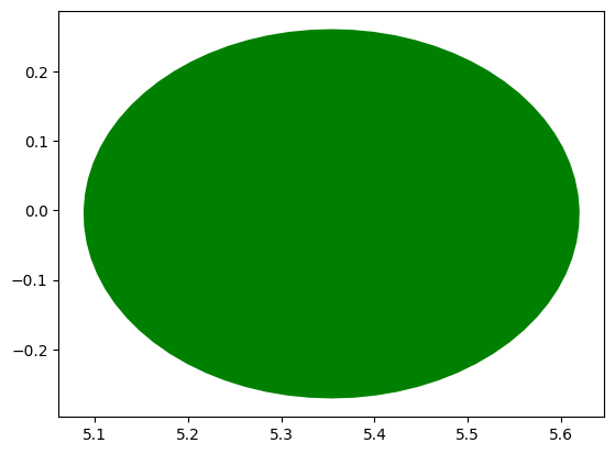
You can also use the module visualize_matplotlib to plot the horizon in 2D. If you already have the shape, you can use plot_horizon.
[12]:
from kuibit import visualize_matplotlib as viz

viz.plot_horizon(shape, color='r', edgecolor='b')
[12]:
[<matplotlib.patches.Polygon at 0x7fa1e38e9450>]
Alternatively, you can use the higher level functions plot_horizon_on_plane_at_iteration or plot_horizon_on_plane_at_time. These take directly a OneHorizon object and the desired iteration/time.
[13]:
viz.plot_horizon_on_plane_at_time(h1, time=0, plane="xy", color='g')
[13]:
[<matplotlib.patches.Polygon at 0x7fa1e75b2ad0>]
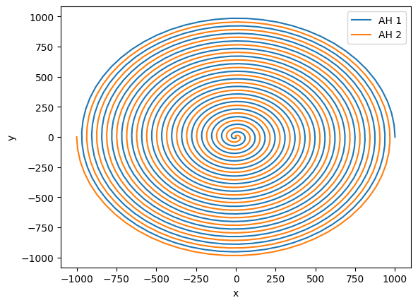
There are some operations that are very common in simulations of binary black holes. For example, computing the coordinate separation between the centroids of the horizons or the angular velocity of the binary. The module hor_utils contains several of these functions.
To illustrate some of these functions, we manually create two OneHorizon objects that are nicely inspiraling. The details of how this is done are not important, so you can ignore the next cell and assume you have two horizons, one three times as massive as the other one.
[14]:
from kuibit.cactus_horizons import OneHorizon
from kuibit.timeseries import TimeSeries

from kuibit import hor_utils

times = np.linspace(0, 100, 1000)
# We add a 0.1 to avoid having identically zero separation
cen_x = 0.1 + 10 * (times[-1] - times) * np.cos(times)
cen_y = 0.1 + 10 * (times[-1] - times) * np.sin(times)
cen_z = np.zeros_like(times)
area = np.ones_like(times)

hor1 = OneHorizon(ah_vars={
                    "centroid_x": TimeSeries(times, cen_x),
                    "centroid_y": TimeSeries(times, cen_y),
                    "centroid_z": TimeSeries(times, cen_z),
                    "area": TimeSeries(times, area),},
                    qlm_vars=None, shape_files=None, vtk_files=None)

hor2 = OneHorizon(ah_vars={
                    "centroid_x": -TimeSeries(times, cen_x),
                    "centroid_y": -TimeSeries(times, cen_y),
                    "centroid_z": TimeSeries(times, cen_z),
                    "area": 3 * TimeSeries(times, area),},
                    qlm_vars=None, shape_files=None, vtk_files=None)
First, let’s plot the tracjectory. For that, we do not need any special function.
[15]:
plt.plot(hor1.ah.centroid_x, hor1.ah.centroid_y, label="AH 1")
plt.plot(hor2.ah.centroid_x, hor2.ah.centroid_y, label="AH 2")
plt.xlabel("x")
plt.ylabel("y")
plt.legend()
[15]:
<matplotlib.legend.Legend at 0x7fa1e4358050>
This looks like a nice inspiral, but what if we moved to the frame of the center of mass? It is difficult to compute a gauge-invariant center of mass, so here we estimate it with the Netwonain formula and the irreducible mass of the horizons.
[16]:
com = hor_utils.compute_center_of_mass(hor1, hor2)

# com is a Vector of TimeSeries
com_x, com_y = com[0], com[1]

plt.plot(com_x.y, com_y.y)
plt.xlabel("x_CM")
plt.ylabel("y_CM")
[16]:
Text(0, 0.5, 'y_CM')
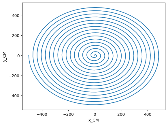
We see that the center of mass is not at the center, as usually assume. We can easily adjust our orbits by subtracting the location of the center of mass, if we want to do so.
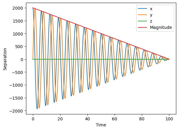
Another common task is to compute the separation, and we can easily compute it along the three axis or its magnitude. The separation comes with a sign: we compute it as hor1 - hor2.
[17]:
separation = hor_utils.compute_separation_vector(hor1, hor2)
separation_magn = hor_utils.compute_separation(hor1, hor2)

plt.plot(separation[0], label="x")
plt.plot(separation[1], label="y")
plt.plot(separation[2], label="z")
plt.plot(separation_magn, label="Magnitude")
plt.xlabel("Time")
plt.ylabel("Separation")
plt.legend()
[17]:
<matplotlib.legend.Legend at 0x7fa1e4213390>